Unlocking responsive components with container style queries
Starting with prebuilt UI components, whether you create them yourself or use an established library, has become a common way of building web applications. The goal is always to offer the consumers of these components consistent UI patterns so they don’t have to start from scratch.
However, there is a catch: after a while, apps built with the same prebuilt components can start to look exactly the same. To solve this, component authors start offering variations in size, shape, color, etc., for components like buttons, loaders, input fields, and others. This gives consumers the flexibility to adapt them to specific layouts and brand contexts.
This brings us to a unique challenge: what happens when we want these variations to respond dynamically to the viewport size? When consumers need to toggle between these variations at specific breakpoints, many current solutions force them to step outside of CSS, the natural place for such design decisions.
This blog post covers how to use Container Style Queries to handle these responsive variations natively with CSS. We will use a button element with size variations as an example. However, the same approach can easily be applied to any UI element and any variation type (such as size, shape, or color).
This post is split into the following sections: defining component variations, the responsive problem, and finally, solving it with style queries. I’ve also set up an interactive CodePen demo so you can follow along with the code directly.
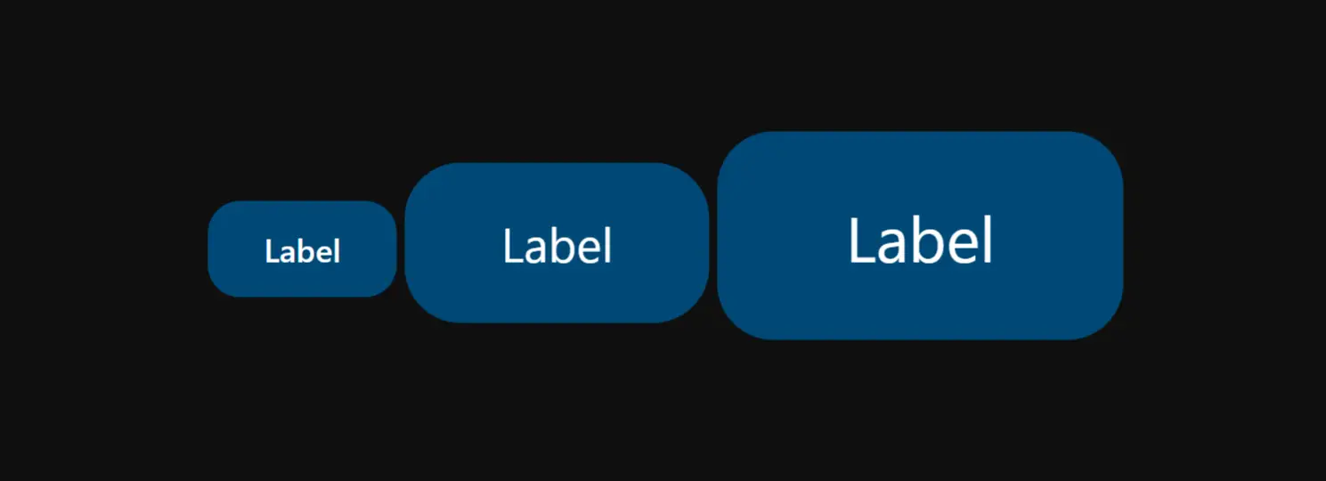
Before we dive into the solution, let’s imagine that as component authors, we need to offer the consumer a button with three size variations: small, medium, and large.
Defining Component Variations
A typical HTML and CSS implementation uses modifier classes to handle these variations. Even if you use JavaScript frameworks or Web Components, they often abstract this exact pattern under the hood by mapping component props or attributes to these underlying classes. Here is a simplified example of how we can achieve this:
.button {
  /* ... Base styles ... */
  block-size: 3rem;
  font: 500 1rem/1.5rem system-ui;
  border-radius: 1rem;
  padding: 0.75rem 1.75rem;
  gap: 0.5rem;

  &.medium {
    block-size: 5rem;
    font: 400 1.5rem/2rem system-ui;
    border-radius: 1.75rem;
    padding: 1.5rem 3rem;
    gap: 0.75rem;
  }

  &.large {
    block-size: 6.5rem;
    font: 400 2rem/2.5rem system-ui;
    border-radius: 1.75rem;
    padding: 2rem 4rem;
    gap: 1rem;
  }
}
We create medium and large variants. We omit the small variant as it’s the default.
The consumer gets the size they want by adding the modifier class to the base class .button.
<!-- Returns small size button -->
<button class="button">...</button>

<!-- Returns large size button -->
<button class="button large">...</button>
The Responsive Problem
The challenge starts when the consumer wants different component variations at different viewport sizes.
For example, imagine a consumer needs a button to have a small size in narrow viewports, but transition to a large size in wider viewports. Current solutions force the consumer into one of three restrictive paths:
- Using predefined viewport-based variations: The consumer is stuck with specific breakpoints provided by the component author. This approach also heavily relies on build steps.
- Using JavaScript: The consumer must toggle classes through a
ResizeObserveror amatchMediaquery. This adds unnecessary work to the main thread and can cause layout thrashing or a Flash of Unstyled Content (FOUC). - Exposing raw CSS properties to the consumer: This approach has two major problems. First, it exposes internal properties that the consumer shouldn’t need to manage, defeating the purpose of component encapsulation. Second, it’s quickly becoming an unrealistic approach since complex components will often require many property changes. Switching variations can sometimes even involve pseudo-classes and pseudo-elements.
As you may have noticed, these solutions are very costly for the component consumer.
The Solution: Container Style Queries
Container style queries are a CSS feature that lets you style elements based on the style properties of a parent container. Right now, browser support is limited to querying custom properties (CSS variables). Fortunately, that is exactly the tool we need.
We will recreate the variations with style queries using a custom property named --size-items.
Note: The naming --size-items is a deliberate choice here; the goal is to give the consumer enough context that this custom property will be used on the parent container to target its items, following the same pattern of regular CSS properties like place-items, justify-items…
We will keep the modifier classes for the static instance, but since CSS doesn’t allow grouping classes and @container rules together, duplicating the variation styles between the containers and the modifiers is necessary. However, this only needs to be done once at the component definition level, so the consumer will have no additional costs.
.button {
  /* ... Base styles ... */
  block-size: 3rem;
  font: 500 1rem/1.5rem system-ui;
  border-radius: 1rem;
  padding: 0.75rem 1.75rem;
  gap: 0.5rem;

  /* Modifier classes here... */
  /* Still needed for static instances */

  @container style(--size-items: medium) {
    block-size: 5rem;
    font: 400 1.5rem/2rem system-ui;
    border-radius: 1.75rem;
    padding: 1.5rem 3rem;
    gap: 0.75rem;
  }

  @container style(--size-items: large) {
    block-size: 6.5rem;
    font: 400 2rem/2.5rem system-ui;
    border-radius: 1.75rem;
    padding: 2rem 4rem;
    gap: 1rem;
  }
}
Just like the modifiers, we omit the small variant as it is the default.
Now, the consumer can change the --size-items custom property value on the parent element to get the desired size variations.
<div class="content">
  <button class="button">Label</button>
</div>.content {
--size-items: large;
}The previous snippet will render a large button without the need of the .large class modifier. Notice how we set --size-items on the .content container, not the button itself. This is a normal CSS pattern we use to position items within a box with regular CSS properties like justify-items.
The definition of our custom property works like this:
The --size-items custom property defines the default size variant for all items in the container; the keyword will be ignored by items that don’t support it.
This completely solves our responsive problem. The consumer now only needs to update the --size-items custom property inside a regular CSS media query on the parent element to get the variants they want.
.content {
  @media (width >= 840px) {
    --size-items: medium;
  }
  @media (width >= 1200px) {
    --size-items: large;
  }
}
In this example, the button starts small. It switches to medium when the viewport width hits 840px. It switches to large when the viewport width hits 1200px.
This is a huge win. The consumer controls the button size variations across viewport widths with just one custom property and standard media queries.
Preventing Variable Leaks with @property
While the above solution is awesome, we can make it even more robust.
Right now, any ancestor can update the size variation. If a consumer sets --size-items: large on the body, every button relying on --size-items becomes large.
Consumers usually don’t want this behavior, at least for this type of leaf component. We can limit the updates to the direct parent by registering the custom property and setting its inherits descriptor to false.
@property --size-items {
  syntax: "small | medium | large";
  inherits: false;
  initial-value: small;
}
Now, only the direct parent (the .content in this example) can update the size variations.
<section class="section">
  <div class="content">
    <button class="button">Label</button>
  </div>
</section>
/* This will not work */
.section {
@media (width >= 840px) {
--size-items: medium;
}
}
/* This will work */
.content {
@media (width >= 840px) {
--size-items: medium;
}
}The Escape Hatch: Handling Manual Overrides
The next step is managing overrides. Think of the relation between justify-items and justify-self. One sets the default for all items and the second overrides it. We need a similar architecture here: --size-items sets the default size variant and the modifier class overrides it.
For this pattern to work, classes applied directly to the element must win against the --size-items property of the parent.
For example, suppose a consumer has multiple buttons in the same container. They can set the default variant for all of them to large by declaring --size-items: large on the container. If they decide one of those buttons should remain small, they can simply apply the .small modifier directly to that specific button.
Implementing this behavior requires two architectural adjustments.
First, we have to make sure that our modifier classes are defined after the style queries in the declaration block. That way, the modifier classes will always win. (Another option here is to use CSS @layer to manage the cascade between the containers and the modifiers).
Second, we need to handle the default variation.
The medium and large variations already have modifier classes, so they can override the matching container style query declarations by appearing later in the cascade. But small is different: it is the base/default style, so there is no .small modifier block that can re-apply those styles.
To solve this, we need a way to return to the default styles when the consumer uses the .small class on the component. We can achieve this by wrapping the style queries with :not(.small). This way, those container query declarations will not apply when the component has the .small class, so the component falls back to its base/default styles.
.button {
  /* ... base styles ... */
  block-size: 3rem;
  border-radius: 1rem;
  font: 500 1rem/1.5rem system-ui;
  gap: 0.5rem;
  padding: 0.75rem 1.75rem;

  &:not(.small) {
    @container style(--size-items: medium) {
      block-size: 5rem;
      font: 400 1.5rem/2rem system-ui;
      border-radius: 1.75rem;
      padding: 1.5rem 3rem;
      gap: 0.75rem;
    }
    @container style(--size-items: large) {
      block-size: 6.5rem;
      font: 400 2rem/2.5rem system-ui;
      border-radius: 1.75rem;
      padding: 2rem 4rem;
      gap: 1rem;
    }
  }

  &.medium {
    block-size: 5rem;
    font: 400 1.5rem/2rem system-ui;
    border-radius: 1.75rem;
    padding: 1.5rem 3rem;
    gap: 0.75rem;
  }

  &.large {
    block-size: 6.5rem;
    font: 400 2rem/2.5rem system-ui;
    border-radius: 1.75rem;
    padding: 2rem 4rem;
    gap: 1rem;
  }
}
In the following example, the first button responds to the parent’s query. The second button stays small.
<div class="content">
  <button class="button">Responsive</button>
  <button class="button small">Fixed small</button>
</div>
One Last Thing: @layer
A final polish is to guarantee that the consumer’s styles win all the time. We can achieve this by placing our component definition inside a layer that has less precedence than the consumer’s styles. This ensures consumer styles override the component’s default styles as long as they are using a higher precedence layer or no layer at all.
@layer design-system.components {
  .button {
    /* Base styles & style queries here */
  }
}
The Best News? It’s Fully Interoperable!
If you’ve made it this far, I hope this breakdown helps you get a good perspective on handling viewport-based component variations natively with CSS using container style queries.
And the absolute best news? With the release of Firefox 151.0 in May 2026, container style queries for custom properties are officially supported in all three major browser engines.
This is a major milestone for the web that will open the door to a new era of declarative UI variations.
If I had to describe the future of consuming components, it would look like this snippet:
.quick-settings {
  display: grid;
  gap: 0.25rem;

  @media (width >= 840px) {
    justify-items: center; /* set the default `justify-self` of all items to center */
    --size-items: medium; /* set the default size variation of all items to medium */
    --width-items: wide; /* set the default width variation of all items to wide */
  }
}
That’s all I’ve got for now… thanks for reading! If you have any questions or thoughts, I’d love to hear them. Feel free to reach out to me on Bluesky, X/Twitter, or anywhere else linked in the footer. Also, feel free to play around with the code directly in the interactive CodePen demo.
Reporting bugs & feedback
If you notice a glitch in the code or explanations on this page, please feel free to reach out. I want this blog post to be as helpful as possible, so I’d really appreciate it! :)