A New Wave of CSS
Sine waves are one of the most recognizable mathematical patterns. On the web, their smooth progression can shape animation, typography, spatial layouts, and much more.
Until recently, coordinating a continuous wave across multiple elements meant choosing between frame-by-frame calculations in JavaScript with requestAnimationFrame and rigid CSS offsets generated by preprocessor loops.
Modern CSS lets us express these relationships directly in a stylesheet. Trigonometric functions can shape values, while sibling-index() and sibling-count() let each element use its position in the DOM without manual class names or data attributes.
In this deep dive, we start with two ways to animate a sine wave: a direct trigonometric approach using sin(), and a compositor-friendly technique using staggered animation-delay values. Then we use the same CSS capabilities beyond motion to create harmonic typography and other spatial patterns.
The Structural Baseline
For both techniques, our HTML remains minimal, semantic, and decoupled from styling logic. A simple container holds identical sibling elements:
<div class="container">
  <span class="element"></span>
  <span class="element"></span>
  <span class="element"></span>
  <span class="element"></span>
  <span class="element"></span>
  <!-- ... as many elements as needed ... -->
</div>
Because CSS can now dynamically query how many siblings exist and determine each element’s exact index, we no longer need inline custom properties such as style="--i: 0", index data attributes, or server-rendered counters.
Approach 1: Map the Sine Equation Directly
Start with JavaScript
The easiest way to understand this approach is to begin with a familiar JavaScript expression. For each element, a sine wave can be reduced to one line:
const y = amplitude * Math.sin(time + (index * frequency));Here, y is the vertical position we want to calculate for the current element. Each value has one job:
amplitudescales the-1to1output ofMath.sin(). An amplitude of40produces positions from-40to40.timeis the phase that changes as the animation runs. Here, it represents an angle in radians rather than elapsed time in seconds.indexidentifies the current element and keeps its position fixed within the sequence.frequencycontrols the phase gap between neighboring elements. Increase it to fit more wave cycles into the sequence, or decrease it to stretch the wave out.
We do not animate y directly. We advance time, recalculate y for every element, and apply the result as its vertical translation. If time stops changing, the elements still form a sine curve; it simply becomes a static one.
Let CSS Map the Same Equation
This is where modern CSS becomes exciting. Native sin() gives us the curve, while sibling-index() supplies the index of each element directly from the DOM. The stylesheet now has everything it needs to map the same equation:
@property --angle {
  syntax: "<angle>";
  inherits: false;
  initial-value: 0deg;
}

.element {
  --speed: 1s;
  --amplitude: 40px;
  --frequency: 0.45rad;

  translate: 0 calc(
    sin(var(--angle) + (sibling-index() * var(--frequency))) * var(--amplitude)
  );

  /* Keep the static wave, and animate it only when motion is welcome. */
  @media (prefers-reduced-motion: no-preference) {
    animation: rotate-angle var(--speed) linear infinite;
  }
}

@keyframes rotate-angle {
  to {
    --angle: 360deg;
  }
}
The mapping is almost one-to-one. In CSS, var(--amplitude) takes the role of amplitude, var(--angle) takes the role of time, sibling-index() provides index, and var(--frequency) provides frequency. Strictly speaking, --frequency is a spatial phase step here rather than a temporal frequency; its 0.45rad value moves each sibling 0.45 radians farther along the curve.
To animate the wave, we only need to animate the value playing the role of time. Registering --angle with @property gives the browser a typed angle it can interpolate from 0deg to 360deg. On every frame, CSS combines that changing angle with each element’s fixed sibling index, runs the result through sin(), and maps the new y value to translate.
The Performance Cost: Main-Thread Style Recalculation
This mathematical approach is undeniably elegant. However, animating a custom property that feeds into a trigonometric translation expression comes with a rendering trade-off.
Even with inherits: false preventing inheritance down the tree, the browser must update the computed translate value because it depends on the animated --angle inside calc(sin(...)). In this demo, that work appears as a Recalculate Style task for the elements on each animation frame instead of a translation animation that can run independently on the compositor.
Bramus provides more background on style invalidation and recalculation in his analysis of CSS @property performance.
When profiled in the browser’s DevTools Performance panel, the main thread remains constantly occupied with style calculations and rendering updates:
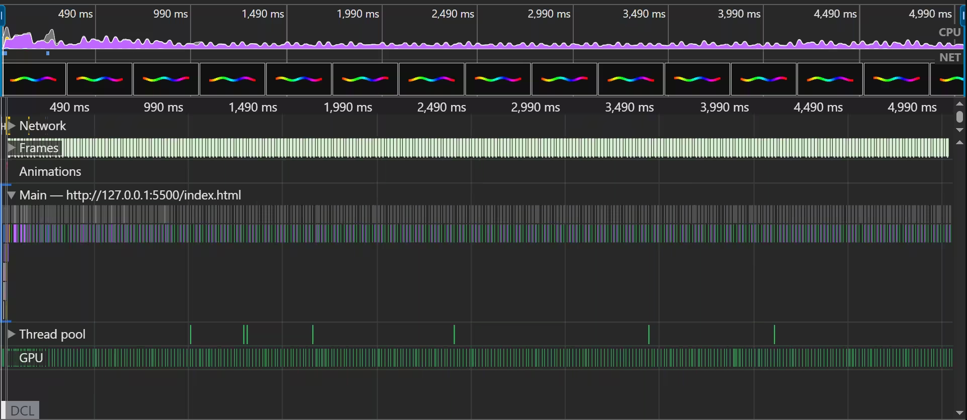
Enabling DevTools Paint Flashing further reveals persistent green rectangles flashing across every element on every tick, confirming that the main thread is repeatedly invalidating and painting the scene:
Approach 2: Staggered Timing with animation-delay
For a compositor-friendly alternative that scales better across many elements, we can use a classic animation mechanic: staggered timing delays.
Instead of recalculating trigonometric positions on every frame, each element runs the same vertical translation. Distributing an animation-delay across siblings with sibling-index() and sibling-count() turns that shared motion into a convincing sine-like wave.
.container {
  /* Choose how many complete waves appear across the container. */
  --waves-visible: 2;
}

.element {
  --duration: 0.45s;
  --amplitude: 40px;

  /* An alternate animation travels forward and back to complete a cycle. */
  --cycle-time: calc(var(--duration) * 2);

  /* Spread those cycles across the gaps between the siblings. */
  --delay-step: calc(
    (var(--cycle-time) * var(--waves-visible)) / (sibling-count() - 1)
  );

  /* Use negative delays so the complete wave is visible immediately. */
  --animation-delay: calc(sibling-index() * var(--delay-step) * -1);

  /* Animate only when the user has not requested reduced motion. */
  @media (prefers-reduced-motion: no-preference) {
    animation: wave var(--duration) ease-in-out var(--animation-delay) alternate infinite;
  }
}

@keyframes wave {
  from {
    translate: 0 var(--amplitude);
  }
  to {
    translate: 0 calc(var(--amplitude) * -1);
  }
}
Map the timing
Each value has one job:
--amplitudesets how far each element moves from the center. A value of40pxproduces positions from-40pxto40pxon the Y-axis.--cycle-timesets the duration of one complete up-and-down cycle. Becausealternateruns the animation forward and then backward, the cycle takes--duration * 2.--delay-stepsets the time gap between neighboring elements. To fit--waves-visiblecycles acrossNelements, it divides the time covered by those cycles by the number of gaps between them:sibling-count() - 1.* -1turns the delay negative, starting every element partway through its animation. This makes the complete wave visible as soon as the page loads.ease-in-outcontrols how each element moves between its two endpoints. It is a cubic Bézier curve rather than a sine function, but it creates a similar rhythm: slow near the turning points and fastest through the center.
The Compositor Advantage
Why can this approach outperform the trigonometry version?
Because the keyframes animate the standard translate property directly, without relying on an animated custom property, modern browsers can usually run the animation on the compositor.
After the initial layout and paint, the compositor can move the existing layers without recalculating each element’s position in CSS. In this demo’s performance profile, the main thread remains available for other work:
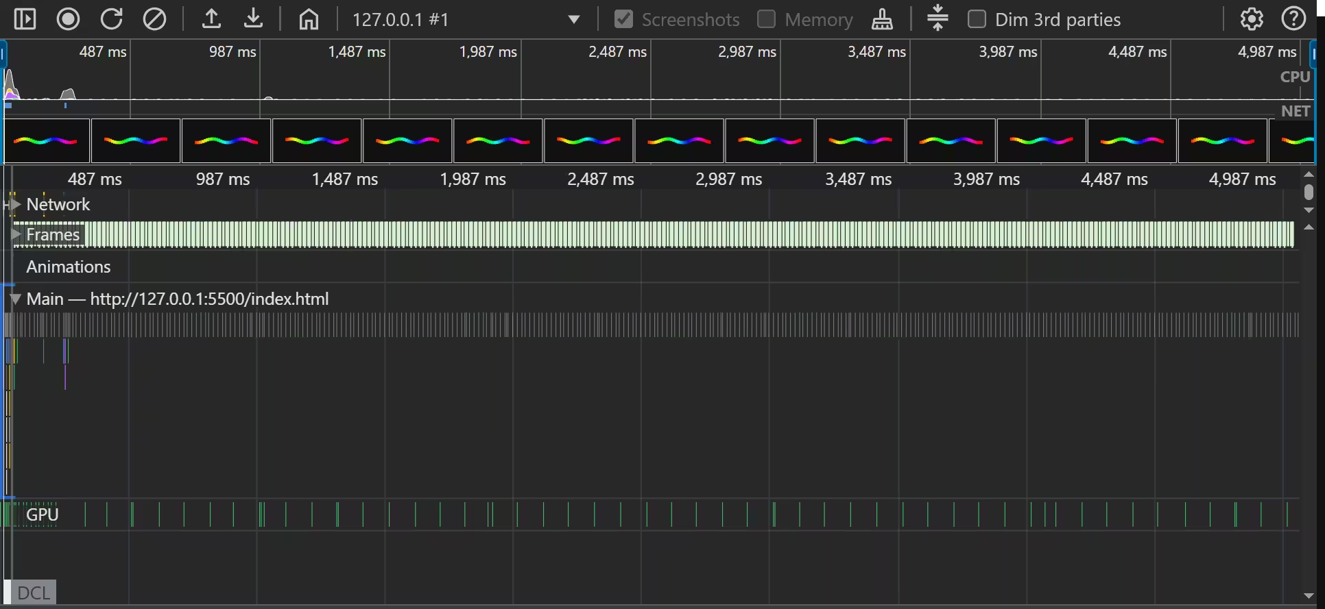
Turning on DevTools Paint Flashing visually confirms the result in this demo: there are no green paint flashes while the wave animates:
Beyond Animation: Where CSS Trigonometry Shines
Does this mean native CSS sin() should be avoided? Not at all.
The performance bottleneck shown here comes from continuously animating a custom property that affects a calculated translation. For static spatial distribution, native CSS trigonometry is extraordinarily capable.
In static scenarios, the browser evaluates the trigonometric formula when styles are resolved and again only when a relevant input changes. Unlike the continuously animated formula, it does not deliberately trigger a new calculation on every frame.
A striking example is harmonic typography: distributing variable font weights across characters in a word to create an organic half-wave arch:
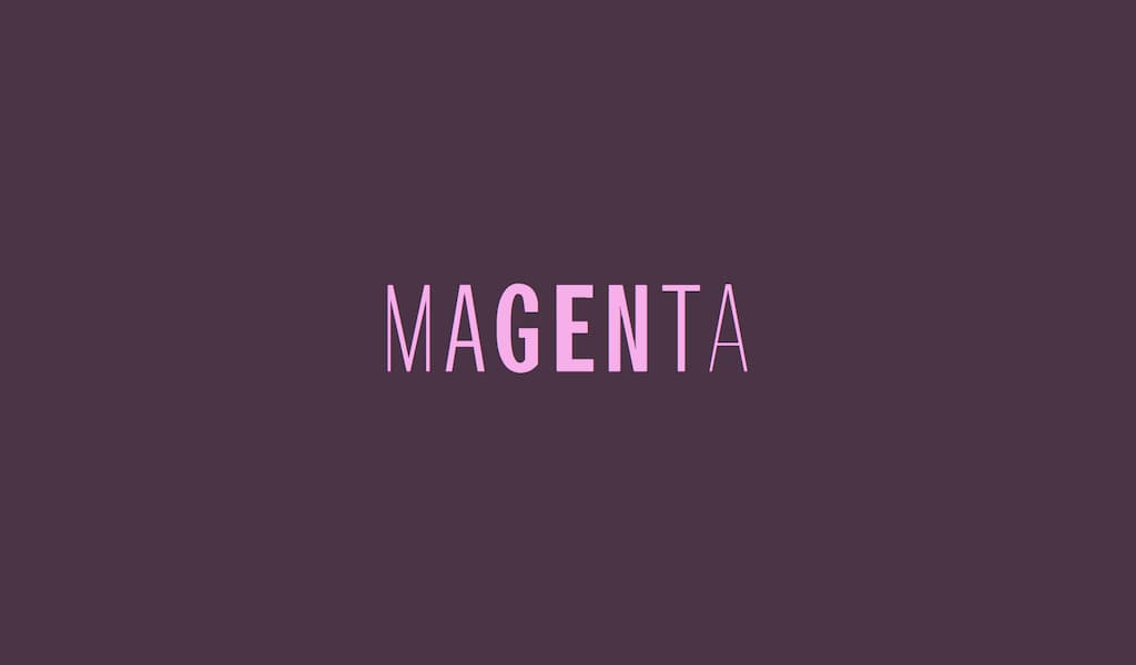
By mapping each character’s position to a normalized angle between 0° and 180°, sin() smoothly ramps the font weight from 200 at the edges to 600 in the center:
.char {
  --min-weight: 200;
  --max-weight: 600;
  --amplitude: calc(var(--max-weight) - var(--min-weight));

  /* Map the first and last letters from 0 to 1. */
  --progress: progress(sibling-index(), 1, sibling-count());

  /* Convert that progress to a 180deg half-sine arch. */
  --angle: calc(var(--progress) * 180deg);

  /* Apply the result statically, with no per-frame animation work. */
  font-weight: calc(
    var(--min-weight) + (sin(var(--angle)) * var(--amplitude))
  );
}
Notice how the modern progress() function simplifies the mapping. Instead of manual arithmetic like calc((sibling-index() - 1) / (sibling-count() - 1)), progress(sibling-index(), 1, sibling-count()) computes the normalized ratio from 1 to sibling-count() directly.
Beyond typography, this pattern opens up:
- Distributing navigation elements along circular or elliptical curves without SVG or Canvas.
- Designing wave-like card cascades and staggered editorial grids.
- Building radial menus where every child computes its angular offset automatically.
Interactive Demos
To see each of these architectural patterns in action and experiment with the parameters directly, check out the CodePen demos:
- Performant Sine Wave — Animation Delay — A compositor-friendly wave built from staggered translations.
- Trigonometric Wave — CSS sin() and @property — A mathematical wave animated with native CSS trigonometry.
- Harmonic Typography — Variable Font Weights — A static half-wave mapped across character font variations.
If you’ve made it this far, I hope these examples open your eyes to how much expressive power has found its way into CSS. With sibling-index() and sibling-count() now available across all three major browser engines, this feels like a great moment to explore what becomes possible when CSS can count, calculate, and shape values on its own.
That’s all I’ve got for now… thanks for reading! If you have any questions or ideas, I’d love to hear them. Feel free to reach out to me on Bluesky or anywhere else linked in the footer, and play around with the CodePen demos to see where these patterns take you.